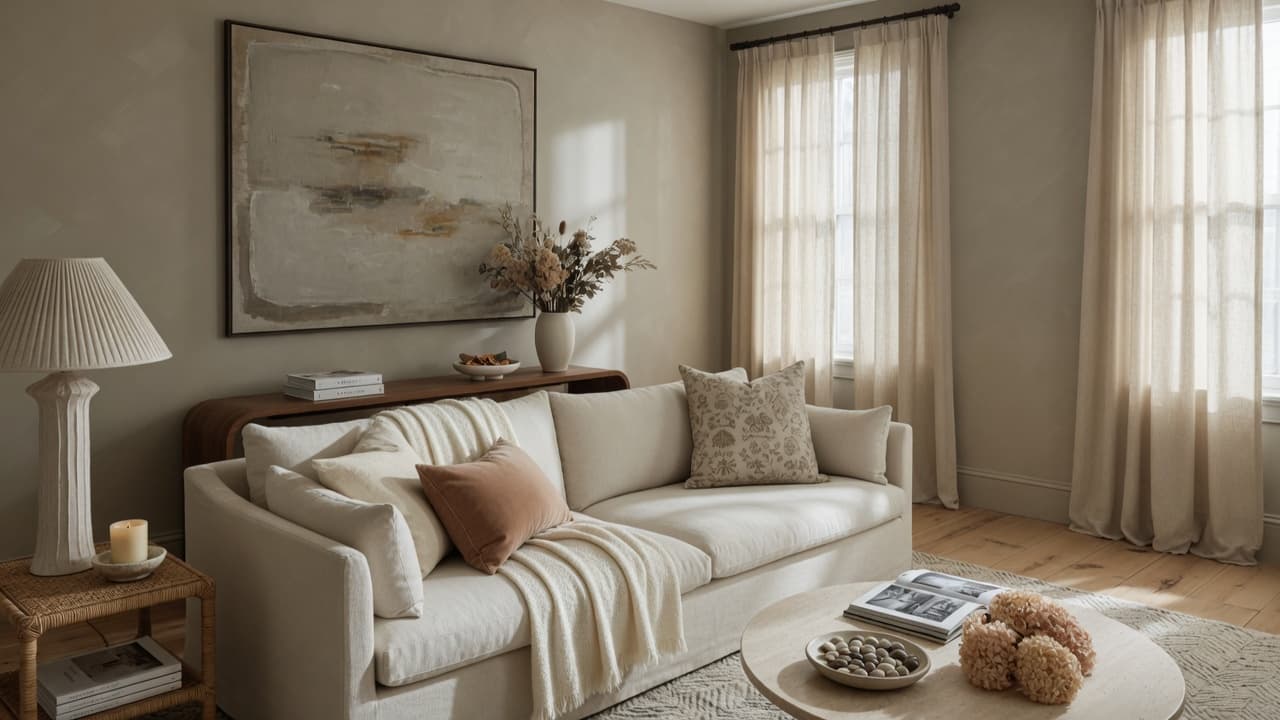
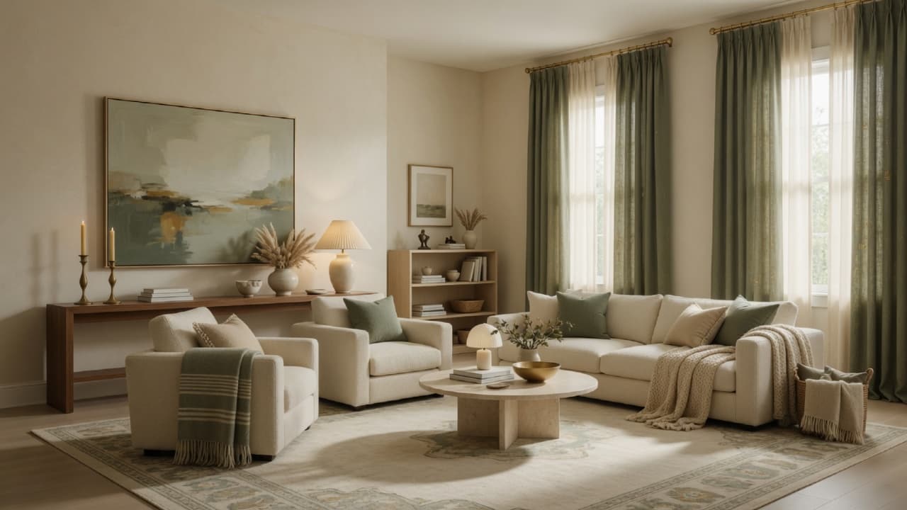
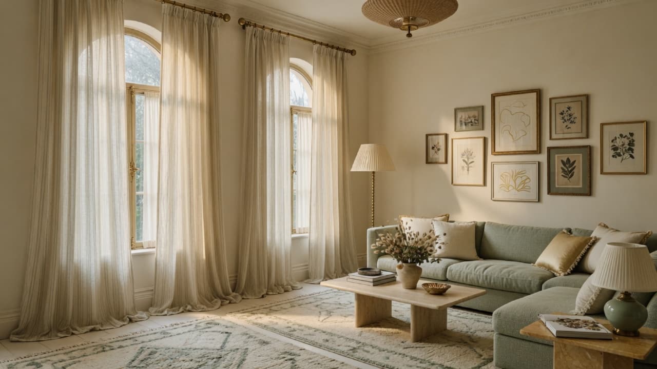
How to Make Your Home Look Expensive on a Budget: 25 Designer Secrets That Actually Work
Make your home look expensive without spending thousands. Learn 25 designer secrets for scale, light, color, textures, curtains, rugs, art, and styling, with measurements, checklists, and budget-friendly upgrades.
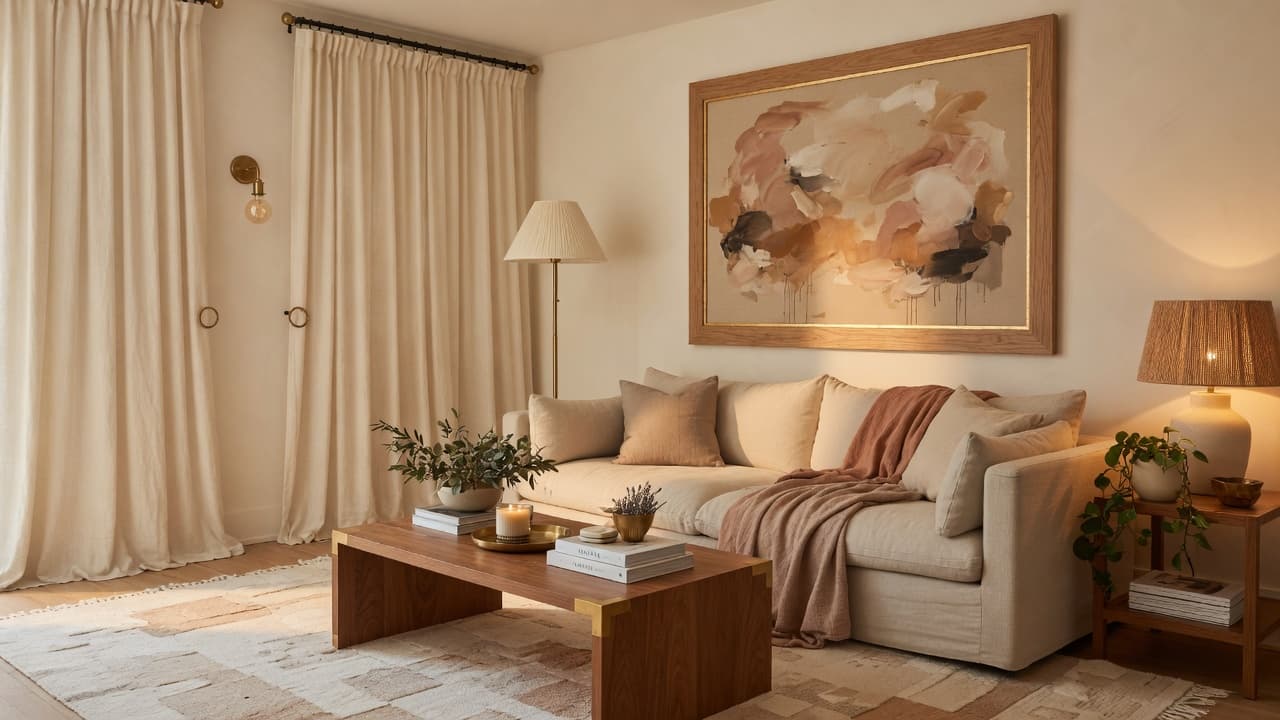
A luxurious home is not built from a single designer sofa or a gut renovation. It is built from decisions: scale, light, color, texture, and editing. Guests do not scan price tags. They respond to proportion, warmth, and calm.
If your rooms feel almost finished, busy, or oddly cheap after shopping, the gap is rarely taste. It is usually a handful of fixable foundations. This guide shares 25 designer secrets that actually work so you can make your home look expensive on a budget, whether you own, rent, or decorate a small apartment.
You will get practical measurements, shopping priorities, visual formulas, and a printable checklist. Educate your eye first. Buy second.
Why expensive-looking homes are about design, not price
Professionally styled interiors share the same visual cues:
- Scale. Rugs, art, and coffee tables are sized to the furniture and the room.
- Light. Warm, layered lamps replace a single cool overhead bulb.
- Cohesion. Color and metal finishes feel related from room to room.
- Texture. Soft, nubby, smooth, and polished surfaces sit together.
- Editing. Surfaces look intentional because clutter has been reduced.
When those cues are wrong, even good furniture can look temporary. When they are right, thrifted pieces and ready-made curtains can look collected and calm.
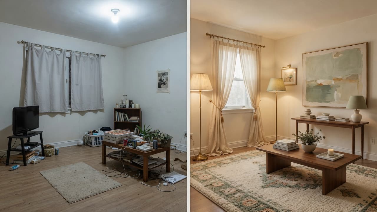
Many of the mistakes that undermine a high-end look are covered in depth in 17 home decorating mistakes that make your home look cheap. Fix those first, then layer the secrets below.
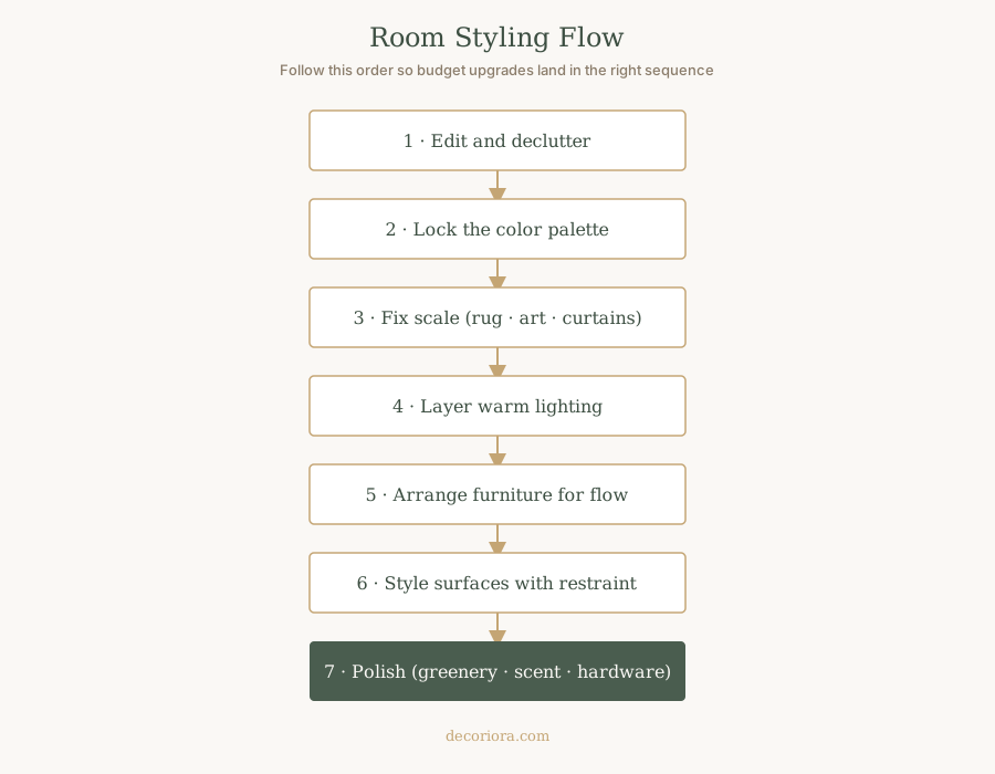
How to use this guide
Work in this order for the best return on a limited budget:
- Edit and declutter
- Lock a color palette
- Fix scale (rug, curtains, art)
- Layer warm lighting
- Arrange furniture for flow
- Style surfaces with restraint
- Polish with greenery, scent, and hardware
Secret 1. Declutter before you decorate
Why it works: Visual noise is the fastest way to make a room look inexpensive. Designers edit first so every remaining object can read as intentional.
How to do it:
- Clear counters, coffee tables, and dresser tops completely.
- Return only items you use daily or love enough to display.
- Group small items on a tray so they read as one composition.
- Hide packaging, charging cables, and product piles.
Quick takeaway: Editing is free polish. Buy after you can see the bones of the room.
Secret 2. Choose a cohesive color palette
Why it works: Competing colors feel chaotic. A calm, related palette makes thrifted and new pieces look like they belong together.
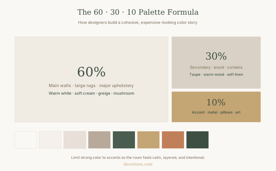
Designer formula: 60 · 30 · 10
| Role | Percent | Use it for |
|---|---|---|
| Main | 60% | Walls, large rug, major upholstery |
| Secondary | 30% | Wood tones, curtains, secondary textiles |
| Accent | 10% | Metal, pillows, art, small décor |
Warm neutrals (cream, greige, mushroom, soft taupe) read more expensive than stark cool white or a scatter of bright accents. Limit strong color to the ten percent.
Secret 3. Size the rug like a foundation, not a mat
Why it works: A postage-stamp rug under only the coffee table isolates furniture and makes the room look temporary. A correctly scaled rug unifies the seating group.
Designer rules:
- Front legs of the sofa and chairs sit on the rug when possible.
- Leave about 12 to 18 inches of floor around the seating group when space allows.
- In many American living rooms, 8×10 or 9×12 outperforms a 5×7.
For room-by-room sizes, use the complete rug size guide.
Budget move: A large simple natural-fiber or washable neutral rug looks more expensive than a small busy pattern. Spend on size before pattern.
Secret 4. Hang curtains high and wide
Why it works: Low rods shorten the wall and shrink the window. High, wide drapery adds height and polish for relatively little money.
Designer measurements:
- Mount the rod about 4 to 6 inches below the ceiling (or halfway between frame and ceiling in very tall rooms).
- Extend the rod 8 to 12 inches past each side of the window when space allows.
- Choose panels long enough to kiss the floor or break lightly on it.
- Prefer fuller width so fabric does not look skimpy when closed.
Full hanging rules live in how high curtains should be hung.
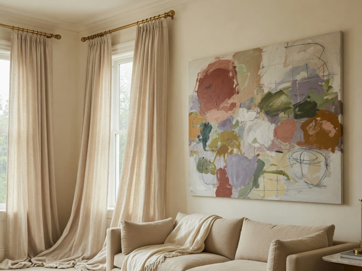
Secret 5. Use oversized art (or one strong statement)
Why it works: Tiny frames scattered on a large wall look unfinished. One larger piece, or a tightly planned gallery, anchors the room.
Designer measurements:
- Center art about 57 to 60 inches from the floor.
- Above a sofa or console, leave 6 to 10 inches between furniture top and frame bottom.
- Aim for art about two-thirds to three-quarters the width of the furniture below.
See the full wall art placement guide for galleries, beds, and fireplaces. Renters who need those proportions without drilling can use no-drill wall decor methods.
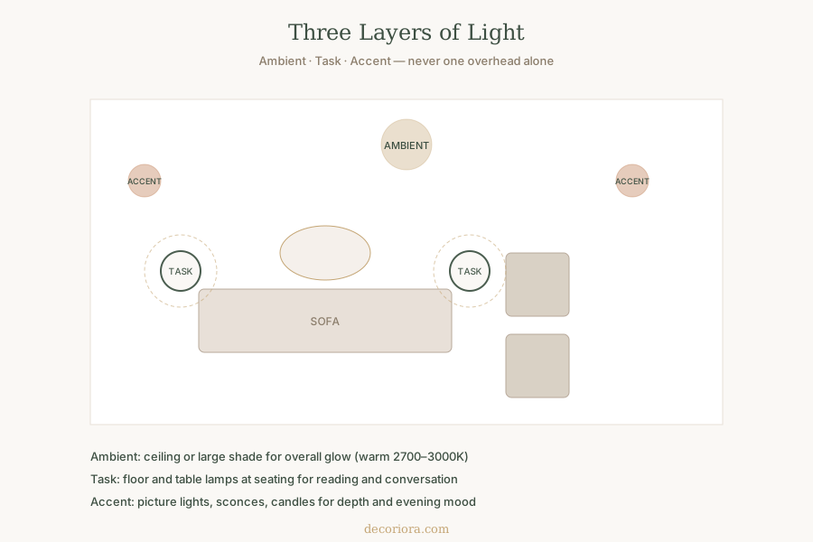
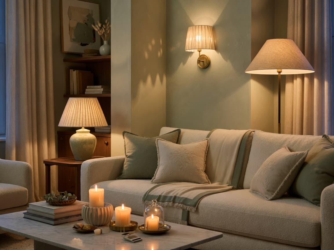
Secret 6. Layer warm lighting like a designer
Why it works: A single cool overhead light flattens every surface. Layered warm light is one of the strongest “expensive home” cues.
Three layers:
- Ambient: soft overall glow (ceiling or large shaded fixture)
- Task: floor and table lamps at seating
- Accent: sconces, picture lights, candles for depth
Use bulbs in the 2700K to 3000K range for living spaces. Aim for more than one light source per room.
Secret 7. Arrange furniture for conversation, not walls
Why it works: Furniture stuck to every wall creates a waiting-room center. Floating a seating group makes the room feel intentional and more expensive.
Rules that work:
- Pull the sofa 3 to 6 inches off the wall when you can.
- Face chairs toward conversation, not only the TV.
- Keep main walkways about 30 to 36 inches wide.
- Size the coffee table to about two-thirds the sofa length, with 14 to 18 inches between sofa edge and table.
For twenty-one layout rules, read how to arrange living room furniture.
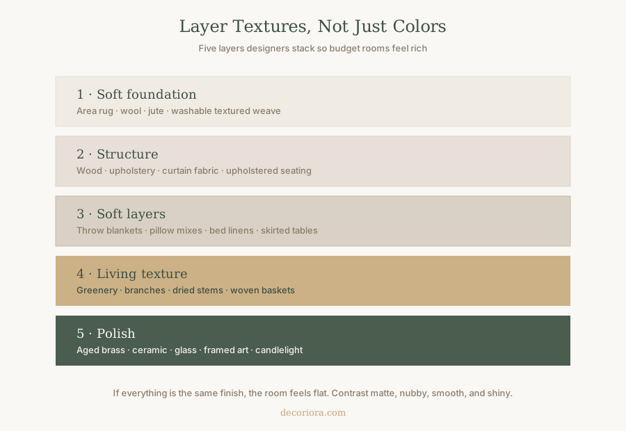
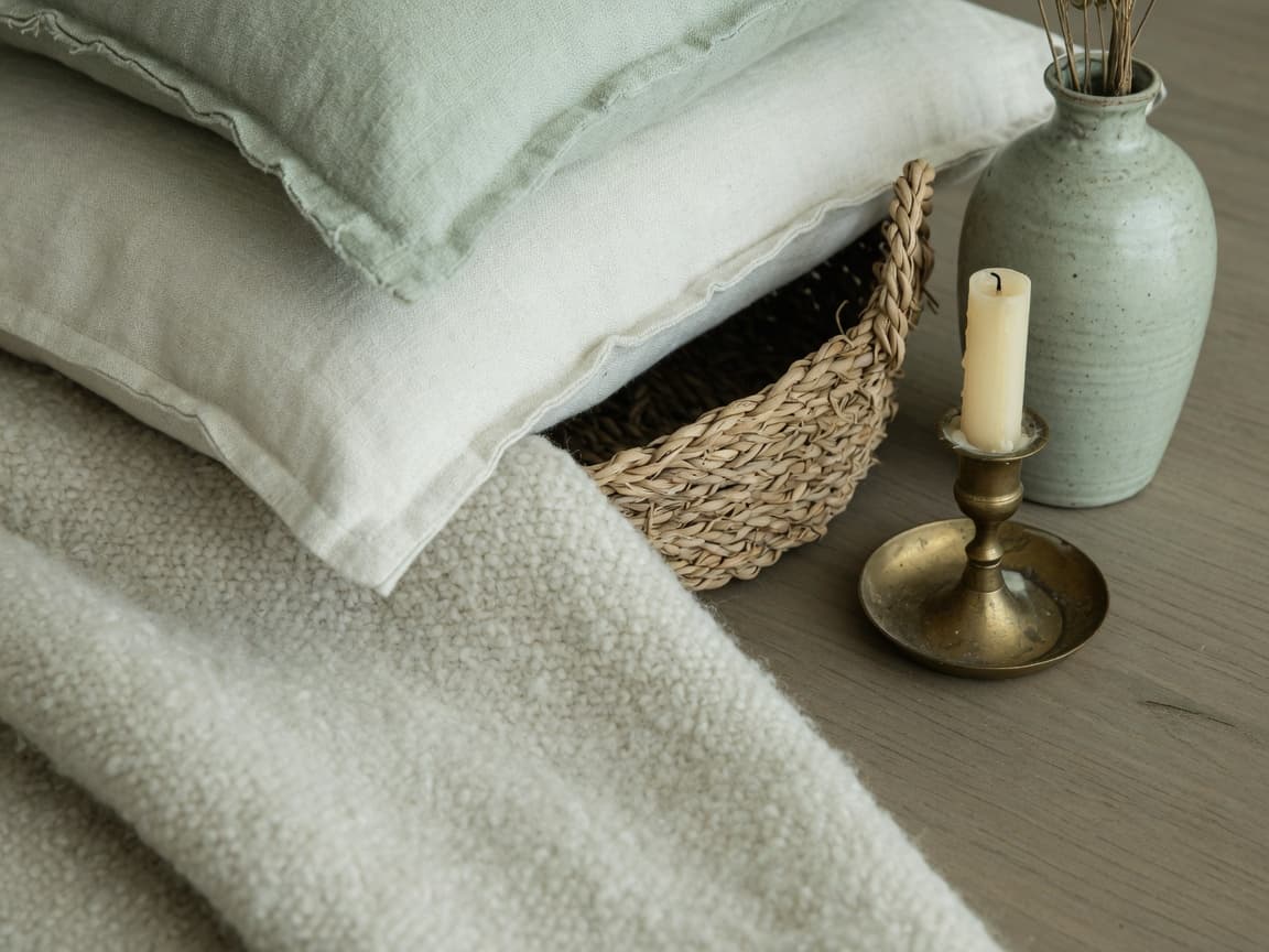
Secret 8. Layer textures, not only colors
Why it works: Flat, matching surfaces look like a catalog set. Mixed textures look collected and rich even when the palette is simple.
Stack at least three of these in a room:
- Soft foundation (rug)
- Structure (wood, upholstery)
- Soft layers (throws, pillows, linen)
- Living texture (plants, branches, baskets)
- Polish (metal, ceramic, glass, framed art)
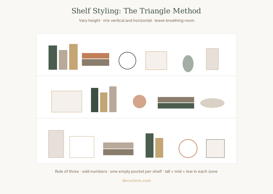
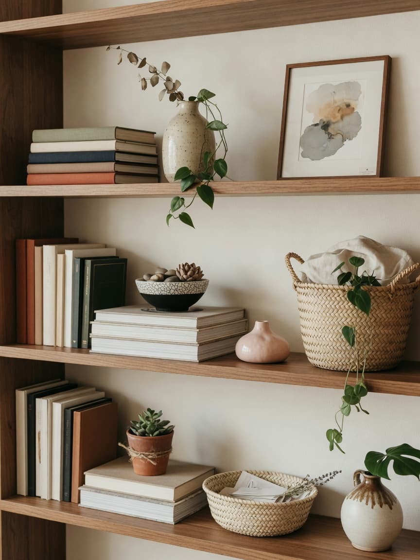
Secret 9. Style shelves with triangles and empty space
Why it works: Packed shelves look like storage. Styled shelves look like design.
Formula:
- Vary heights (tall, mid, low) in a loose triangle
- Mix vertical books with horizontal stacks
- Use odd numbers of objects in small groups
- Leave one empty “breathing” pocket per shelf
- Repeat materials so the wall feels cohesive
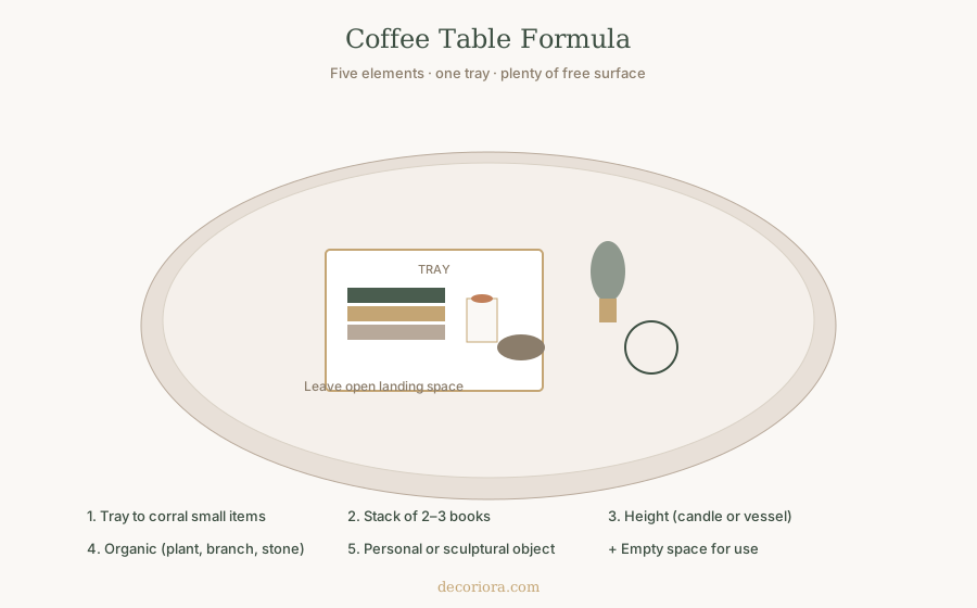
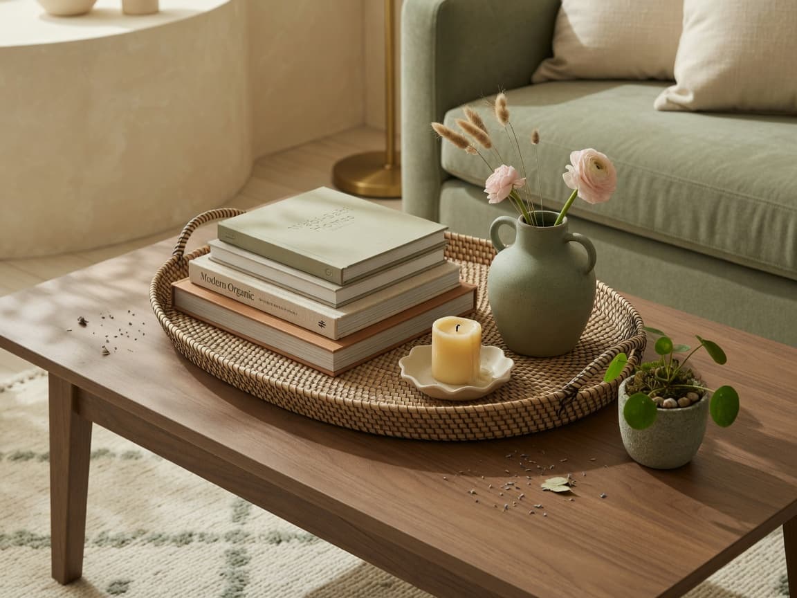
Secret 10. Style the coffee table like a small still life
Why it works: An empty table can feel sparse. A crowded one feels messy. A simple formula looks expensive and still usable.
Five elements:
- Tray to corral small items
- Stack of two or three books
- Height (candle or vessel)
- Organic piece (plant, branch, stone)
- Personal or sculptural object
Always leave open landing space for a cup or remote.
Secret 11. Use mirrors to expand light and space
Why it works: Mirrors bounce daylight, double lamp glow at night, and make small rooms feel more generous when placed with intention.
Where they work best:
- Opposite or adjacent to a window to catch light
- Over a console to create a foyer moment
- In a dark hallway to add depth
Avoid a tiny mirror floating too high. Treat scale like art: larger and lower usually looks more intentional.
Secret 12. Mix affordable pieces with one premium anchor
Why it works: All-cheap rooms can feel thin. All-expensive rooms can still fail if scale is wrong. The designer trick is a mix: one stronger anchor plus quieter supporting pieces.
Strong anchors often include:
- Correctly scaled rug
- Comfortable sofa in a solid fabric
- Quality lamps
- One large artwork
Save on:
- Seasonal pillows
- Secondary vessels
- Some greenery
- Secondary side tables (if proportions are right)
Secret 13. Upgrade hardware and small finishes
Why it works: Hands and eyes hit knobs, pulls, switches, and faucets daily. Consistent, slightly more refined finishes signal care.
Budget plan:
- Choose one metal family per zone (for example, warm brass or matte black)
- Replace mismatched cabinet knobs in the most visible run
- Swap dated switch plates for clean simple ones
- Update shower curtain rings, towel bars, or entry hooks as allowed
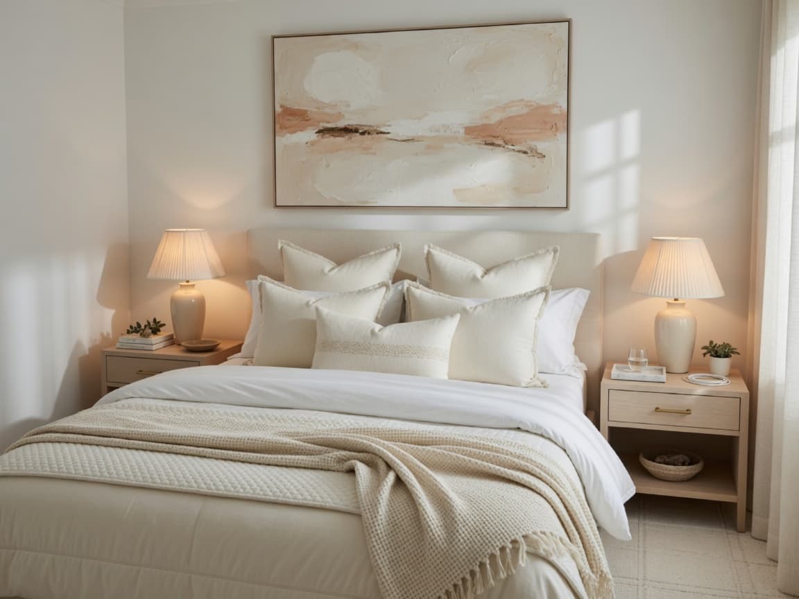
Secret 14. Style the bed in hotel layers
Why it works: A flat, single-layer bed looks unfinished. Layered bedding looks plush even on a modest mattress.
Simple stack:
- Fitted sheet + quality flat sheet if you use one
- Duvet or quilt in a calm color
- Two sleeping pillows + two euro or decorative shams
- One textured throw folded at the foot
- Optional lumbar pillow in a related tone
Keep the palette tight. Texture does the luxury work.
Secret 15. Edit decorative pillows carefully
Why it works: Too many small, mismatched pillows look busy. A few well-scaled pillows look tailored.
Guidelines:
- Start with two larger pillows and one smaller accent on a standard sofa
- Mix textures within the same color family
- Avoid logos and overly trendy phrases if you want a timeless look
- Fluff and “karate chop” only if it fits your style; clean rectangular structure can look just as expensive
Secret 16. Add greenery and organic shape
Why it works: Plants and branches break the hard geometry of furniture and make rooms feel alive.
Easy options:
- One taller floor plant in a simple pot
- A branch or stems in a ceramic vessel
- A small herb tray in the kitchen if light allows
- High-quality faux only when real plants will fail (low light, travel)
One strong plant often looks better than five struggling tiny pots.
Secret 17. Design for scent and atmosphere
Why it works: Expensive-feeling homes engage more than sight. Soft scent and calm evening light complete the experience.
Keep it subtle:
- Clean base first (no product can replace that)
- One signature candle or diffuser, not three competing fragrances
- Soft lamps in the evening instead of bright overhead alone
Atmosphere is part of luxury, not an afterthought.
Secret 18. Control visual clutter every week
Why it works: Luxury is maintenance as much as styling. Mail, toys, and packaging return fast.
Lightweight system:
- One catch-all tray by the entry
- A basket for remote controls and chargers
- Clear kitchen counters nightly if possible
- A ten-minute Sunday reset of main surfaces
If organization is the bigger challenge, pair this article with calm systems from Decoriora’s organization guides in the shop.
Secret 19. Create a clear focal point in each room
Why it works: Rooms without a focus feel scattered. One primary focal point (fireplace, art, window view, headboard wall) gives the eye a place to rest.
How to choose:
- Living room: fireplace, large art, or the window composition
- Bedroom: the bed wall
- Dining: the table under a pendant or a strong art piece
Support the focal point. Do not compete with five equal “loud” objects.
Secret 20. Hide cords, packaging, and plastic
Why it works: Visible cords and branded packaging instantly undercut an expensive look.
Quick fixes:
- Cord clips and covers along baseboards
- Baskets for routers and power strips
- Decant soap refill bottles in baths and kitchens
- Remove shipping boxes and hangers from view
This is pure presentation. Cost is minimal. Impact is high.
Secret 21. Repeat materials room to room
Why it works: Homes that feel expensive feel connected. Repeating wood tones, metal finishes, and textile families creates flow.
You do not need matching sets. You need relationships: similar wood warmth, related metals, and a shared neutral base.
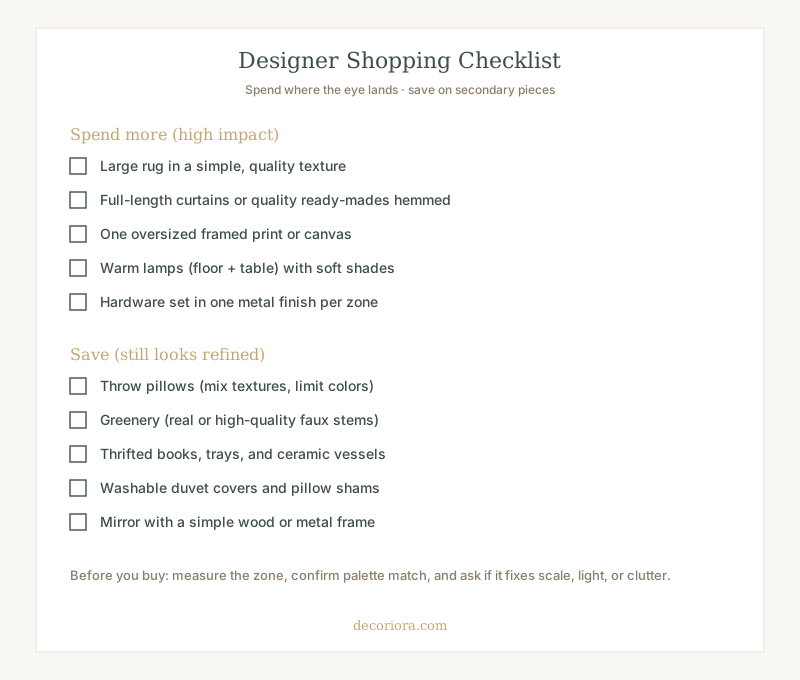
Secret 22. Shop with a designer checklist, not impulse
Why it works: Impulse décor is how rooms fill with small items that never improve scale or light.
Before any purchase, ask:
- Does this fix scale, light, color, or clutter?
- Does it match the palette?
- Do I know the measurement for this zone?
- Can I name where it will live today?
Secret 23. Prefer fewer, better objects
Why it works: Many small accessories create noise. Fewer stronger objects create calm.
Replace a cluster of tiny décor with:
- One larger vessel
- One solid tray
- One substantial lamp
- One oversized art piece
Negative space is a design material. Use it.
Secret 24. Fix the five mistakes that most often look cheap
When budget is tight, reverse these first:
| Mistake | Why it looks cheap | Better solution |
|---|---|---|
| Rug too small | Furniture floats | Size up; front legs on rug |
| Curtains too low | Room loses height | Rod high and wide; full length |
| Art too high or tiny | Walls feel awkward | Center 57-60"; size to furniture |
| One cool overhead light | Flat, harsh rooms | Warm layered lamps |
| Cluttered surfaces | No visual rest | Edit; tray; empty space |
These also appear in the home decorating mistakes guide. Correcting them often matters more than a new sofa.
Secret 25. Follow a room-by-room system, not random Pinterest saves
Why it works: Random inspiration boards create half-finished rooms. A simple system creates consistency.
Use this sequence in every room:
- Function (how the room is used)
- Edit
- Palette
- Scale pieces (rug, curtains, art)
- Light layers
- Layout
- Surface styling
- Living details (plants, scent)
For a complete room-by-room path to a warm, collected, Anthropologie-inspired home without overspending, the Anthropologie Inspired Home Without Overspending ebook walks through practical styling systems you can apply space by space.
From Our Collection
Anthropologie Inspired Home Without Overspending
A complete room-by-room system for a warm, collected, expensive-looking home using timeless design principles and budget-aware choices.
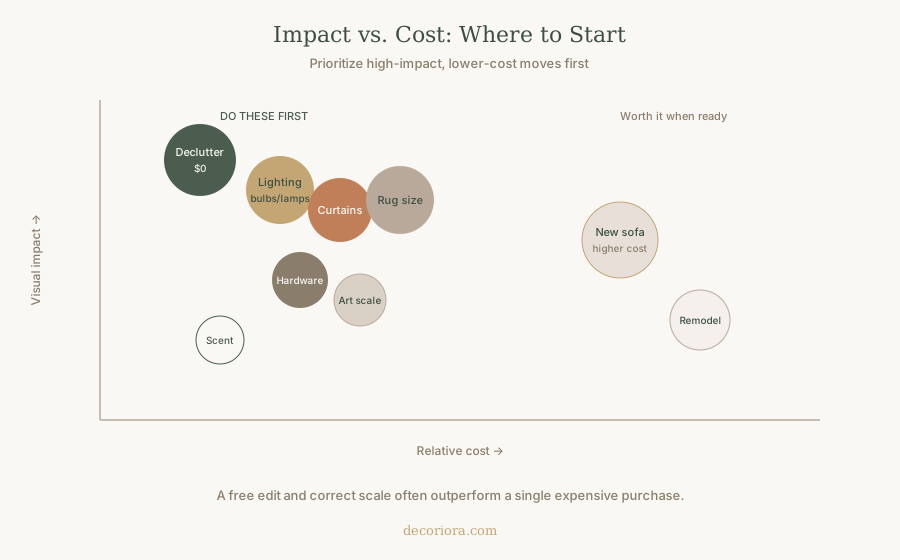
Budget-friendly upgrade map
| Upgrade | Typical cost level | Visual impact | Start here if… |
|---|---|---|---|
| Declutter + edit | Free | Very high | Surfaces feel busy |
| Warm bulbs + lamps | Low-medium | Very high | Room feels flat or cool |
| Curtains high/wide | Low-medium | High | Windows look short |
| Larger rug | Medium | Very high | Seating looks disconnected |
| Oversized art | Low-medium | High | Walls feel empty or fussy |
| Hardware refresh | Low | Medium-high | Finishes look mismatched |
| New sofa | Higher | High only with correct scale | Seating is broken or wrong size |
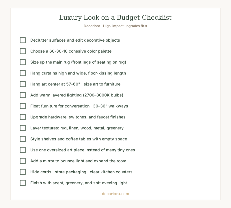
Printable luxury decorating checklist
Save or print this checklist and work through one room at a time.
Quick reference: designer measurements
| Element | Designer target |
|---|---|
| Rug around seating | Front legs on rug; ~12-18" floor border when possible |
| Curtain rod height | ~4-6" below ceiling; extend 8-12" past window |
| Art center height | 57-60" from floor |
| Art above sofa gap | 6-10" from furniture top to frame |
| Coffee table gap | 14-18" from sofa edge |
| Coffee table length | About 2/3 of sofa length |
| Walkways | 30-36" main paths |
| Light color | 2700-3000K in living spaces |
Putting it all together
Making your home look expensive on a budget is not about faking wealth. It is about applying timeless design principles consistently:
- Edit first
- Choose a cohesive palette
- Fix scale (rug, curtains, art)
- Layer warm light
- Arrange for conversation and flow
- Style with restraint
- Polish with texture, greenery, and hardware
Do those well, and even modest furniture starts to look intentional. Skip them, and expensive pieces still feel unfinished.
Start with one room this weekend. Photograph before and after. Once you see how scale and light change the feeling of the space, the next rooms become easier, calmer, and more confident.
When you want a full room-by-room roadmap for this warm, collected aesthetic, explore Anthropologie Inspired Home Without Overspending. For deeper dives on the foundations, continue with the rug size guide, curtain height rules, wall art placement, and living room furniture layouts.
Your home does not need a bigger budget to feel elevated. It needs clearer decisions.
Frequently asked questions
How can I make my home look expensive on a budget?
Focus on scale, light, and editing before buying new furniture. Choose a larger rug, hang curtains high and wide, warm up lighting to 2700-3000K, hang art at eye level, declutter surfaces, and layer a few quality textures. These moves usually cost less than replacing major pieces and create a more expensive-looking room.
What cheap upgrades make a house look expensive?
The highest-impact low-cost upgrades are decluttering, matching a cohesive color palette, swapping to warm light bulbs, adding floor and table lamps, hanging curtains near the ceiling, sizing up the rug, installing consistent hardware finishes, and using one oversized piece of art instead of many tiny frames.
How do designers make rooms look luxurious?
Designers prioritize proportion, layered warm lighting, cohesive color, and intentional empty space. They size rugs and art to the furniture, hang drapery high, float seating for conversation, mix textures, and edit clutter so every surface has a job. Luxury is a visual system, not a single expensive sofa.
What colors make a home look more expensive?
Warm neutrals such as soft cream, greige, mushroom, and warm white look more expensive than stark cool white or a rainbow of competing colors. Use a 60-30-10 formula: sixty percent main tone, thirty percent secondary (wood, textiles), and ten percent accent (metal, pillows, art). Limit bold color to accents.
How do I make a rental or apartment look expensive?
Use temporary upgrades that respect your lease: tension or wall-safe curtain rods when allowed, large washable rugs, freestanding lamps, peel-and-stick options only if permitted, oversized lean art or proper hanging with landlord-approved methods, styled shelves, and cleared counters. Scale and light still matter more than permanent remodel work.