17 Home Decorating Mistakes That Make Your Home Look Cheap (And How to Fix Them)
Fix the decorating mistakes that quietly make rooms look unfinished, including rug size, curtain height, art placement, lighting, and furniture scale, with designer measurements and budget-friendly solutions.
You can spend real money on a sofa, a paint job, and a cart full of “pretty” accessories, then still walk into the room and feel like something is off. The space looks busy, temporary, or strangely unfinished. That gap is rarely about bad taste. It is almost always about scale, light, placement, and editing.
Professionally styled homes do not look expensive because every item cost a fortune. They look expensive because the proportions are right, the light is warm and layered, and every surface has a clear job. When those foundations fail, even good furniture can read as cheap.
This guide walks through 17 home decorating mistakes that make a home look cheap, why each one happens, what designers do differently, and how to fix it without a gut renovation. You will get practical measurements, room rules, and budget-friendly swaps you can use this weekend.
Why homes look cheap even after decorating
Before the list, a useful mindset shift helps. Guests do not calculate your budget. They respond to visual cues:
- Scale. Is the rug, art, and coffee table sized to the furniture and the room?
- Light. Is the room lit only by one cool overhead bulb, or by warm layers?
- Placement. Does furniture create conversation and flow, or cling to walls?
- Editing. Are surfaces calm enough to look intentional?
Fix those four, and rooms that felt “almost there” start to feel collected and calm. For a deeper, room-by-room treatment of fifty mistakes with checklists and diagrams, see The Home Decorating Mistakes Guide.
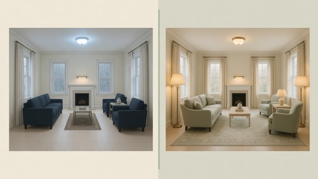
1. Choosing a rug that is too small
Why people make this mistake: Small rugs cost less, ship easily, and look “fine” in the store. Under a coffee table alone, a 5x7 can seem complete until the seating is arranged around it.
Why it makes the room look cheap: A postage-stamp rug isolates the table and leaves sofa and chairs floating on bare floor. The seating group looks disconnected, temporary, and smaller than it is.
What designers do differently: They treat the rug as the foundation of the conversation zone, not as a mat for the coffee table. Front legs of major seating sit on the rug so the arrangement reads as one composition.
How to fix it:
- Measure the seating group, not only the table.
- Choose a size so front legs of the sofa and chairs land on the rug, with about 12 to 18 inches of floor border around the group when possible.
- In many living rooms, step up to 8x10 or 9x12 instead of staying at 5x7.
- Place the rug first, then settle furniture onto it.
Budget-friendly alternative: A large natural-fiber or washable rug in a simple neutral often looks more expensive than a small patterned “feature” rug. Spend on size before pattern.
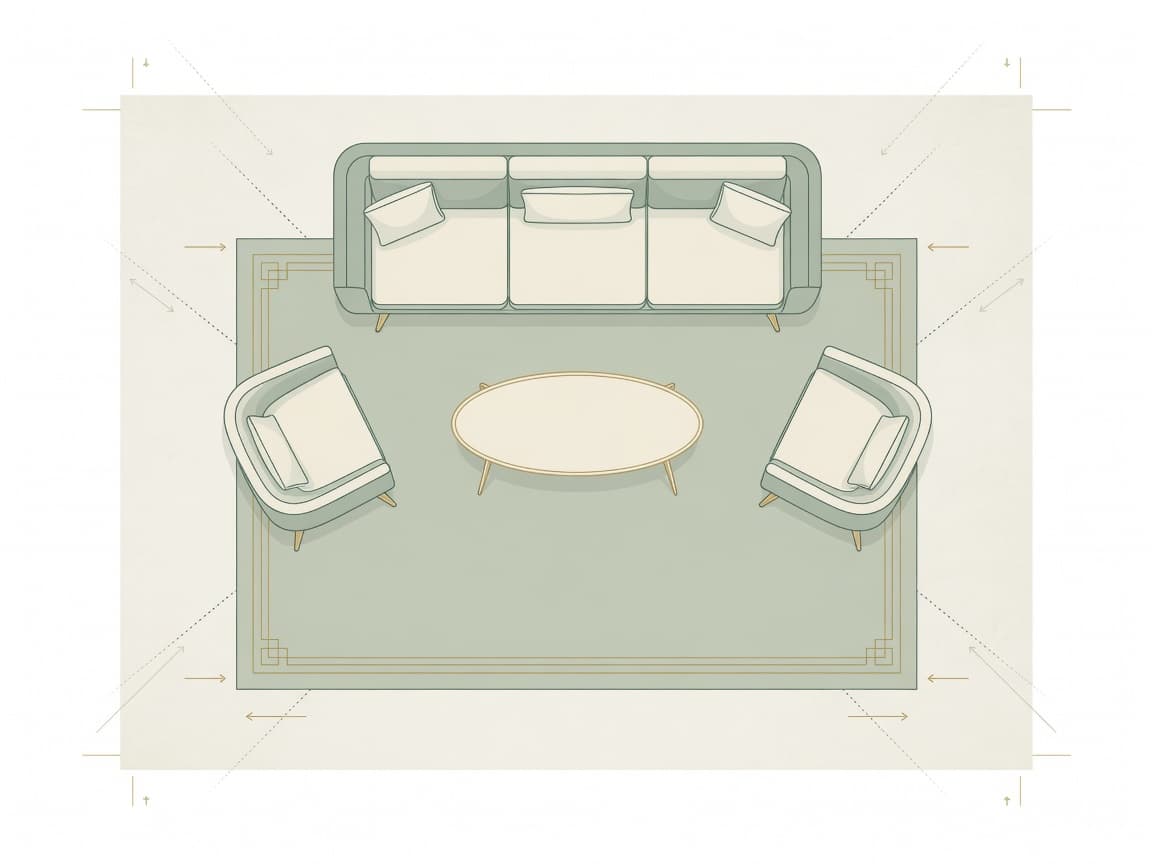
Quick takeaway: Buy the largest rug your layout and budget allow. Scale beats pattern.
2. Hanging curtains too low
Why people make this mistake: Hardware instructions often place the rod just above the window frame, so that is where many people mount it.
Why it makes the room look cheap: Low rods shorten the wall, shrink the window, and leave an awkward band of wall above the drapes. The room loses height and polish.
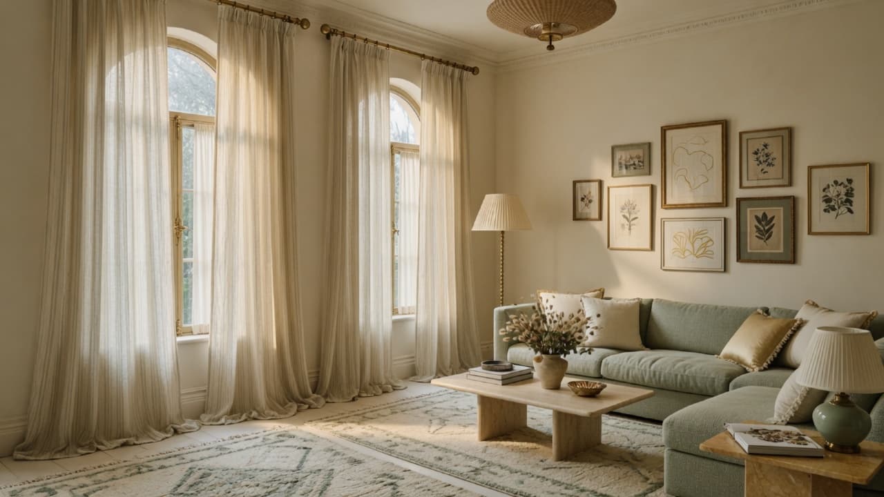
What designers do differently: They hang rods high and wide so fabric stacks clear of the glass when open and the window feels taller and more generous.
How to fix it:
- Mount the rod about 4 to 6 inches below the ceiling (or halfway between frame and ceiling in very tall rooms).
- Extend the rod 8 to 12 inches past each side of the window when space allows.
- Choose panels long enough to kiss the floor or break softly on it. Avoid floating mid-calf hems.
- Prefer wider panels so they look full, not skimpy.
Budget-friendly alternative: Ready-made panels in a solid linen-look fabric, hemmed if needed, beat short “exact window width” sets. Tension rods and plug-in hardware help in rentals when allowed by your lease. For more rental-safe ideas, explore the Renter-Friendly Home Decor Guide.
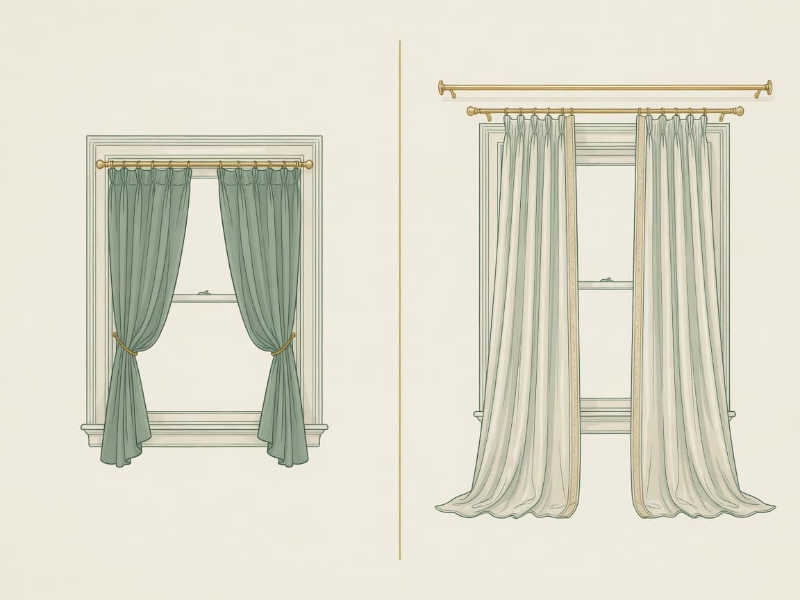
Quick takeaway: High rod, wide span, full length. Height is free polish.
3. Hanging artwork at the wrong height
Why people make this mistake: People hang art while standing and looking up, so pieces drift toward the ceiling. Over sofas, art is often placed without measuring the gap.
Why it makes the room look cheap: High art creates empty dead space below and makes walls feel awkward. Tiny frames over large sofas look lost.
What designers do differently: They hang so the center of the work sits near 57 to 60 inches from the floor, roughly average eye level. Above furniture, they leave a deliberate gap of about 6 to 10 inches.
How to fix it:
- Measure 57 to 60 inches from the floor to the center of the piece (or of a gallery group).
- Above a sofa or console, keep 6 to 10 inches between the furniture top and the frame bottom.
- Size art so it spans roughly two-thirds to three-quarters of the furniture width below it when hanging as a single statement.
Budget-friendly alternative: One larger print in a simple frame often looks more expensive than a scatter of tiny mismatched frames. Thrift frames and custom mats can elevate inexpensive art.
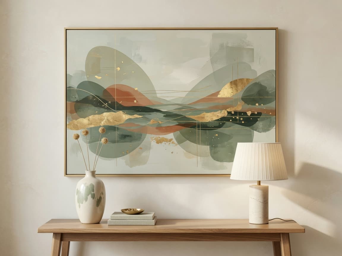
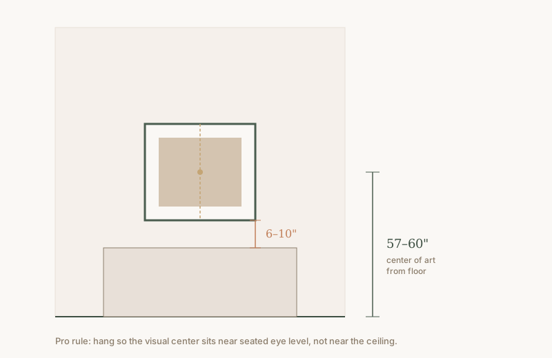
Quick takeaway: Measure to the center of the art, not the top of the frame. If you cannot add holes, keep the same scale rules and use renter-friendly no-drill wall displays.
4. Pushing all furniture against the walls
Why people make this mistake: It feels like the only way to “make space” in a small room, and it is how many of us grew up arranging living rooms.
Why it makes the room look cheap: Furniture stuck to the perimeter creates a dead center, weak conversation, and a waiting-room vibe. The room looks larger on paper but emptier and less intentional in real life.
What designers do differently: They float seating to form a conversation group, leave walkways, and let walls breathe with art, lighting, or negative space.
How to fix it:
- Pull the sofa 3 to 6 inches off the wall when you can.
- Angle or float chairs to face the sofa, not only the TV.
- Keep main walkways about 30 to 36 inches wide.
- Use a correctly sized rug to anchor the floated group.
Budget-friendly alternative: You do not need new furniture. You need a tape measure and a willingness to try one weekend layout experiment. Photograph before and after so you can see the difference.
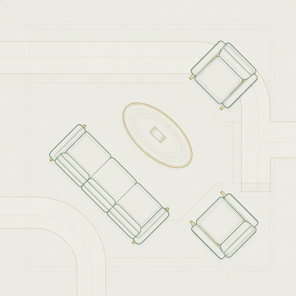
Quick takeaway: Conversation first, walls second. Float the seating group.
5. Using a coffee table that is too small
Why people make this mistake: Small tables are easier to move and cheaper online, and empty floor can feel “open” until the sofa swallows the table visually.
Why it makes the room look cheap: An undersized table looks like a leftover, not a partner to the sofa. Styling on top also fails because there is no surface to work with.
What designers do differently: They size the table to the sofa, usually about two-thirds the sofa length, and leave 14 to 18 inches between sofa edge and table so people can sit and set drinks down.
How to fix it:
- Measure sofa length and aim for a table around two-thirds that length.
- Keep height near seat height (often within a couple of inches).
- Leave 14 to 18 inches of clearance from seat edge to table.
- If a large hard table is impractical, try an oversized soft ottoman with a tray.
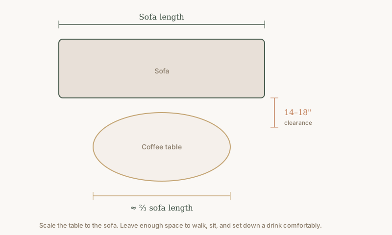
Budget-friendly alternative: A thrifted wood table cut down, a pair of nesting tables, or a large upholstered ottoman can replace a tiny metal “side table as coffee table” look.
Quick takeaway: The table should feel related to the sofa, not like a coaster on the floor.
6. Relying on cool white overhead lighting alone
Why people make this mistake: Builder-grade fixtures and “daylight” bulbs feel bright and practical, so people leave them as the only light source.
Why it makes the room look cheap: Cool, flat light washes out texture and skin tones. One ceiling source creates harsh shadows and a commercial feel in spaces meant for rest.
What designers do differently: They layer ambient, task, and accent light and prefer warm white (about 2700K to 3000K) in living rooms and bedrooms.
How to fix it:
- Swap bulbs to warm white in living spaces.
- Add at least two more sources: floor lamp, table lamp, or plug-in sconce.
- Use dimmers where you can.
- Light corners, not only the center of the room.
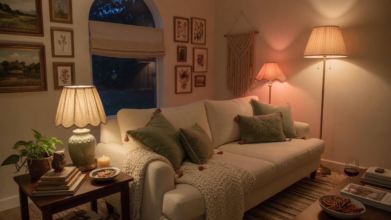
Budget-friendly alternative: Three affordable warm lamps will outperform one expensive cool chandelier for coziness. Even a single well-placed floor lamp changes the entire mood after dark.
Quick takeaway: Warm layers look expensive. One cool bulb looks temporary.
7. Buying a matching furniture set
Why people make this mistake: Sets feel safe. One tag, one finish, one decision.
Why it makes the room look cheap: Perfect matching can look showroom-flat and catalog-dated. Real homes collect pieces over time; complete suites read as temporary staging.
What designers do differently: They mix woods, upholstery, and eras within a shared palette so the room feels personal and layered.
How to fix it:
- Keep one anchor (sofa or bed) and vary the rest.
- Limit yourself to two or three wood tones that share warmth or coolness.
- Repeat metal finishes sparingly so the mix feels intentional.
- Use textiles and art to tie different pieces together.
Budget-friendly alternative: Keep the best piece from a set and replace one item with thrift or a different retailer. For warm, collected styling formulas on a real budget, see Create an Anthropologie-Inspired Home Without Overspending.
Quick takeaway: Coordinated is good. Identical is often dull.
8. Overloading the sofa with throw pillows
Why people make this mistake: Pillows are an easy purchase and feel like “styling.” Marketing photos stack them high.
Why it makes the room look cheap: Too many pillows look fussy, block sitting, and create a store display effect. Mismatched sizes without a plan also feel noisy.
What designers do differently: They use a short formula, not a pile. A common living-room approach is two larger pillows, two medium, one lumbar, mixing texture more than color.
How to fix it:
- Clear every pillow off the sofa.
- Add back two larger pillows (about 22 inches) in a solid or quiet texture.
- Add two medium (about 18 to 20 inches) with pattern or contrast.
- Finish with one lumbar if you like.
- Leave space to sit without reshuffling a mountain.
Budget-friendly alternative: New covers on existing inserts beat buying more stuffed pillows. Two great textures outperform six mediocre ones.
Quick takeaway: Edit pillows until the sofa invites you to sit.
9. Decorating with only small accessories
Why people make this mistake: Small objects are inexpensive and easy to bring home after every shopping trip.
Why it makes the room look cheap: Dozens of tiny items create visual clutter. The eye never rests, so nothing feels special.
What designers do differently: They style with varied height and scale, group objects, and leave negative space. A few larger pieces beat a crowd of miniatures.
How to fix it:
- Clear one surface completely.
- Return only three to five objects using different heights (for example tray, candle, book stack, branch in a vase).
- Leave empty space on purpose.
- Repeat the edit on coffee tables, consoles, and nightstands.
Budget-friendly alternative: Use books you own, a thrifted vase, and one plant. Size and grouping matter more than brand labels.
Quick takeaway: Fewer, larger, better. Empty space is part of the design.
10. Ignoring texture
Why people make this mistake: Matching smooth finishes feels clean and modern, so rooms end up with only hard surfaces and flat fabrics.
Why it makes the room look cheap: Without texture contrast, even a nice color palette looks flat in photographs and in person.
What designers do differently: They mix soft and hard, matte and sheen, woven and smooth, so light catches the room in layers.
How to fix it:
- Aim for at least three textures in every major vignette (for example linen, wood, ceramic).
- Add one soft layer (throw, rug, curtain) if everything feels hard.
- Add one organic element (plant, branch, stone).
- Avoid making every surface shiny plastic or high gloss.
Budget-friendly alternative: A chunky throw, a woven basket, and a wood tray cost less than new furniture and immediately add depth.
Quick takeaway: Texture is free richness when you mix materials you already have.
11. Spacing a gallery wall poorly
Why people make this mistake: Frames go up one at a time without a plan, so gaps become uneven and the group drifts off-center.
Why it makes the room look cheap: Random spacing reads as unfinished. Huge gaps look sparse; tiny uneven gaps look nervous.
What designers do differently: They plan the arrangement on the floor, keep about 2 to 3 inches between frames, and treat the whole cluster as one large shape centered on the wall or furniture below.
How to fix it:
- Lay frames on the floor and photograph the layout.
- Keep gaps roughly 2 to 3 inches.
- Align outer edges so the overall silhouette feels balanced.
- Hang only after the plan is set. Paper templates on the wall help.
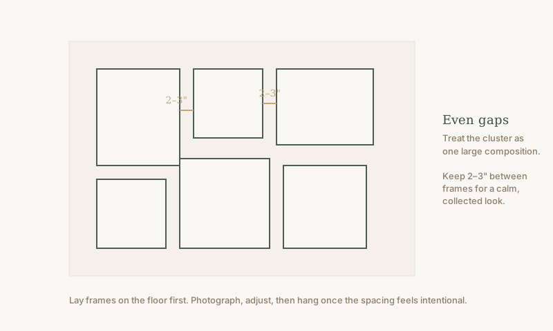
Budget-friendly alternative: Unified frames (or unified mats) make thrift art look intentional even when subjects differ.
Quick takeaway: Even spacing makes a gallery look designed, not accidental.
12. Choosing the wrong dining rug size
Why people make this mistake: People buy the rug for the table footprint alone, forgetting chairs need to stay on the rug when pulled out.
Why it makes the room look cheap: Chairs catch the rug edge every time someone sits. The dining zone looks cramped and unfinished.
What designers do differently: They size the rug so chairs remain on the rug when pulled out, typically adding about 24 inches beyond the table on each side as a starting rule of thumb.
How to fix it:
- Measure the table.
- Add roughly 24 inches on each side for chair pull-out.
- Test by pulling chairs fully out before you commit.
- Prefer low-pile or indoor-outdoor weaves for crumbs and cleaning.
Budget-friendly alternative: A larger simple rug under the dining set beats a small “pretty” rug that fights the chairs daily.
Quick takeaway: If chairs fall off the rug when you sit, size up.
13. Leaving cords and cables visible
Why people make this mistake: Devices multiply faster than cable plans. Chargers, lamps, TVs, and routers leave a black tangle against the wall.
Why it makes the room look cheap: Visible cords shout “temporary setup.” They break clean lines and pull the eye to the mess.
What designers do differently: They hide, route, and contain cables so the room photographs cleanly and feels calmer in person.
How to fix it:
- Unplug and sort what you actually use.
- Use cord covers painted to match the wall, clips along baseboards, or a cable box.
- Cluster power strips behind furniture.
- Choose fewer devices on display.
Budget-friendly alternative: Adhesive cord clips and a simple cable raceway cost little and improve the whole wall.
Quick takeaway: Hide the black spaghetti. Clean lines look expensive.
14. Overfilling open shelves
Why people make this mistake: Open shelves invite display, so every souvenir and leftover mug ends up in a row.
Why it makes the room look cheap: Packed shelves look like storage overflow, not styling. There is no rhythm and no resting place for the eye.
What designers do differently: They style in odd-numbered groups, mix horizontal stacks with vertical objects, and leave negative space on each shelf.
How to fix it:
- Empty the shelves completely.
- Return books, then 1 to 3 objects per grouping.
- Leave at least some open air on every shelf.
- Hide pure clutter in closed storage or baskets.
Budget-friendly alternative: Edit what you own before buying “pretty bins.” For small-space systems that free shelves from overflow, the Small Apartment Organization Bible pairs well with this reset.
Quick takeaway: Style shelves like a magazine vignette, not a storage unit.
15. Choosing a mirror that is too small
Why people make this mistake: Small decorative mirrors feel like jewelry for the wall and are easy to hang alone.
Why it makes the room look cheap: A tiny mirror above a wide console or vanity looks lost and does little for light or proportion.
What designers do differently: They size mirrors to the furniture below, often aiming for about two-thirds the width of a console or vanity, and place them with the same height logic as art.
How to fix it:
- Measure the furniture width.
- Choose a mirror around two-thirds that width when hanging above it.
- Hang so the center sits near eye level when standing at a vanity, or use the 57 to 60 inch art rule for hall consoles.
- One substantial mirror beats three tiny ones in most cases.
Budget-friendly alternative: A large simple mirror from a big-box or thrift store, cleaned and hung correctly, outperforms a small ornate piece in the wrong scale.
Quick takeaway: Mirrors should relate to the furniture, not float as tiny ornaments.
16. Neglecting the entryway
Why people make this mistake: Entries are walk-through zones, so they become dumping grounds for shoes, bags, and mail.
Why it makes the room look cheap: First impressions set the tone for the whole home. Clutter and bare builder walls signal chaos before guests reach the living room.
What designers do differently: They create a simple three-part landing zone: surface, light or mirror, and containment for daily drop-offs.
How to fix it:
- Add a slim console, shelf, or wall-mounted ledge if space allows.
- Add a tray or bowl for keys and a hook or basket for bags.
- Add a mirror or lamp for light and a sense of welcome.
- Limit shoes to what fits in a designated tray or cabinet.
Budget-friendly alternative: A wall hook rail, a small tray, and a thrifted mirror can transform a hallway without a full remodel. If clutter is the real issue, a focused weekend clear-out using The Weekend Declutter Blueprint makes the entry fixes stick.
Quick takeaway: Design the first five feet of home. Welcome is a system.
17. Ignoring paint undertones
Why people make this mistake: People choose paint from a tiny chip under store lighting, or assume “greige” always works.
Why it makes the room look cheap: Pink, green, or yellow undertones clash with flooring and furniture. Walls can look dirty or oddly colored at night.
What designers do differently: They test large samples on multiple walls, check morning and evening light, and coordinate undertones with fixed finishes (floor, counters, cabinets).
How to fix it:
- Paint large samples on at least two walls.
- Live with them for 48 hours in natural and artificial light.
- Hold samples next to flooring, trim, and major upholstery.
- Prefer complex neutrals that flatter your existing materials rather than pure builder white or a random trendy gray.
Budget-friendly alternative: Sample pots cost little compared with repainting the whole room twice. Time spent testing is cheaper than regret.
Quick takeaway: Test big. Undertones matter more than the name on the chip.
How to prioritize fixes when you cannot do everything
If your budget or energy is limited, start where the eye notices first:
- Rug scale in the main living space
- Curtain height and length
- Warm layered lighting
- Art height and size
- Surface editing (coffee table, shelves, entry)
These five changes often transform how expensive a home feels without replacing major furniture.
When you want the complete system
This article covers 17 high-impact decorating mistakes. If you want the full toolkit, The Home Decorating Mistakes Guide expands to 50 mistakes with designer insights, practical fixes, room-by-room checklists, and measurement references you can reuse as your home evolves. It is built for real homes and real budgets, not showroom fantasies.
For warm, collected styling beyond mistake-fixing, pair it with Anthropologie-inspired styling on a budget. For lease-aware upgrades, start with the renter-friendly guide. Browse the full library anytime in the Decoriora shop.
From Our Collection
The Home Decorating Mistakes Guide
Go beyond these 17 fixes. Get 50 detailed decorating mistakes, exact solutions, designer measurements, and printable checklists in one 71-page premium PDF.
Frequently asked questions
What decorating mistakes make a home look cheap?
The biggest visual culprits are a rug that is too small, curtains hung too low, artwork hung too high, furniture glued to the walls, cool overhead-only lighting, and too many tiny accessories. They break scale and calm, which people unconsciously read as unfinished or inexpensive.
What size rug should I buy for my living room?
Choose a rug large enough that the front legs of your sofa and chairs sit on it, with about 12 to 18 inches of floor around the seating group when possible. Many living rooms look better with an 8x10 or 9x12 than with a small rug under only the coffee table.
How high should I hang curtains?
Mount the rod near the ceiling (about 4 to 6 inches below it in many rooms) and extend it past the window so panels can stack off the glass. Hang fabric to the floor for a finished look.
How high should I hang pictures on a wall?
Center artwork around 57 to 60 inches from the floor. Above a sofa or console, leave about 6 to 10 inches between the furniture and the bottom of the frame, and size the art to the furniture below.
How can I make my home look more expensive on a budget?
Correct scale and light first. Larger rug, higher curtains, warm bulbs, right art height, and fewer objects on surfaces often outperform buying new furniture. Edit before you shop.
A home looks expensive when the fundamentals are honest: right size, right height, warm light, and calm surfaces. You do not need a designer’s budget to use a designer’s checklist. Pick one room, fix the first three mistakes you recognize, and build from there. The difference is not perfection. It is intention.