Best Neutral Paint Colors for Every Room: Designer-Approved Color Palettes That Never Go Out of Style
Choose the best neutral paint colors for every room with designer guidance on undertones, warm vs cool neutrals, greige vs beige, light direction, finishes, room palettes, and a printable selection checklist.
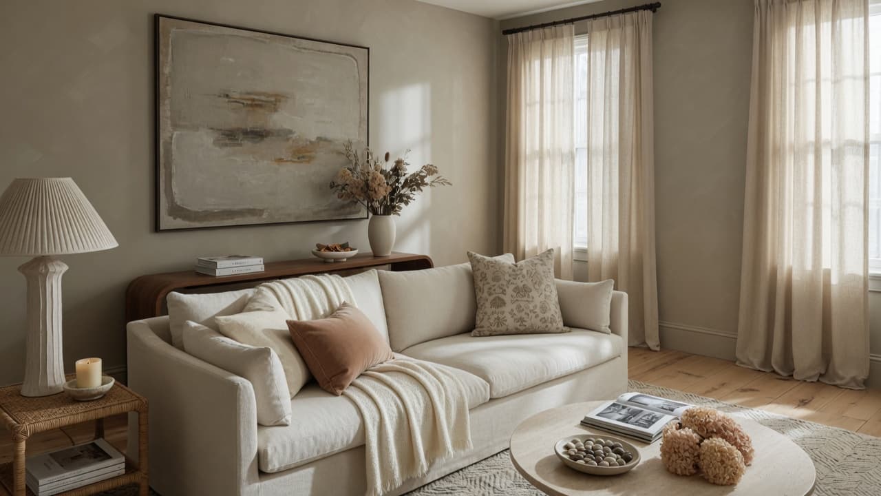
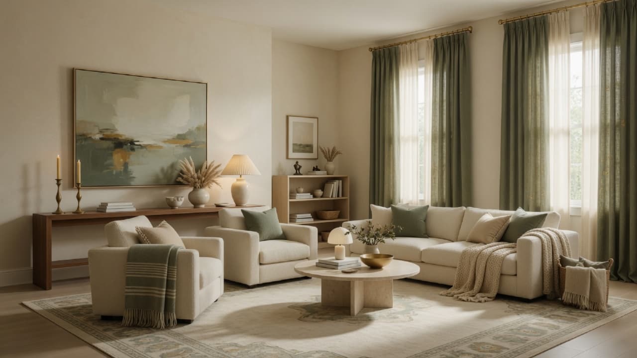
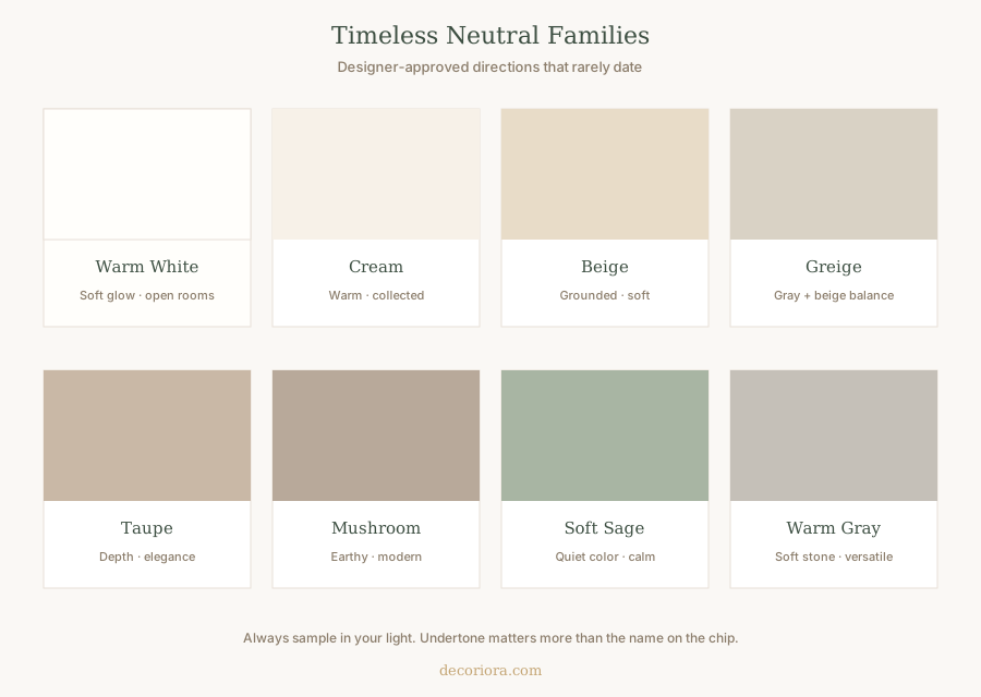
Timeless interiors start with color decisions that support everything else: furniture, rugs, curtains, and light. The best neutral paint colors are not a single trendy chip. They are families of warm whites, creams, beiges, greiges, taupes, mushrooms, soft sages, and warm grays chosen for undertone, light, and flow.
This guide is a room-by-room system for choosing designer-approved neutral palettes that rarely go out of style. You will learn how to read undertones, pick warm vs cool neutrals, match north- and south-facing light, select finishes, and avoid the mistakes that make "safe" paint look wrong.
Educate your eye first. Sample second. Paint last.
Why neutrals still matter
Neutrals do not mean boring. They mean flexible. A well-chosen wall color:
- Makes rooms feel larger or cozier on purpose
- Lets art, textiles, and wood read clearly
- Connects open floor plans
- Ages more gracefully than loud feature walls
Color also affects how expensive a room feels. Wrong undertones and harsh cool whites are common issues in home decorating mistakes that make a home look cheap. Right neutrals support the calm, collected look in how to make your home look expensive on a budget.
Understanding undertones
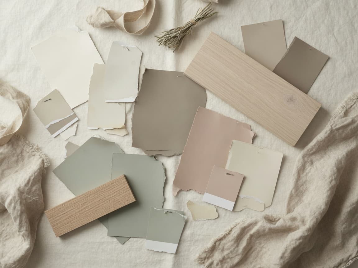
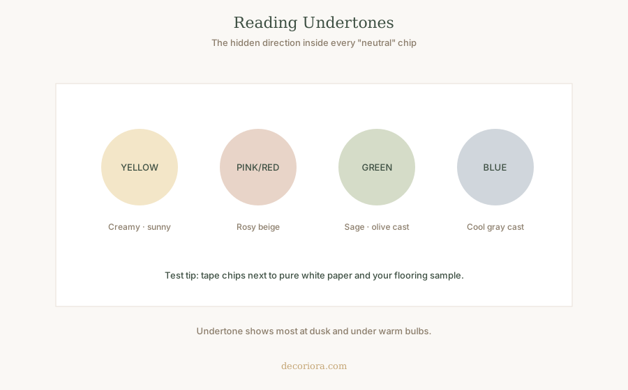
Every neutral has a hidden direction: yellow, pink/red, green, or blue (sometimes violet). That undertone is why two "beiges" fight each other.
How to read a chip:
- Place it next to pure white paper.
- Place it next to your flooring and a wood sample.
- View morning, afternoon, and evening lamp light.
- Look again at dusk when undertones get honest.
Warm vs cool neutrals
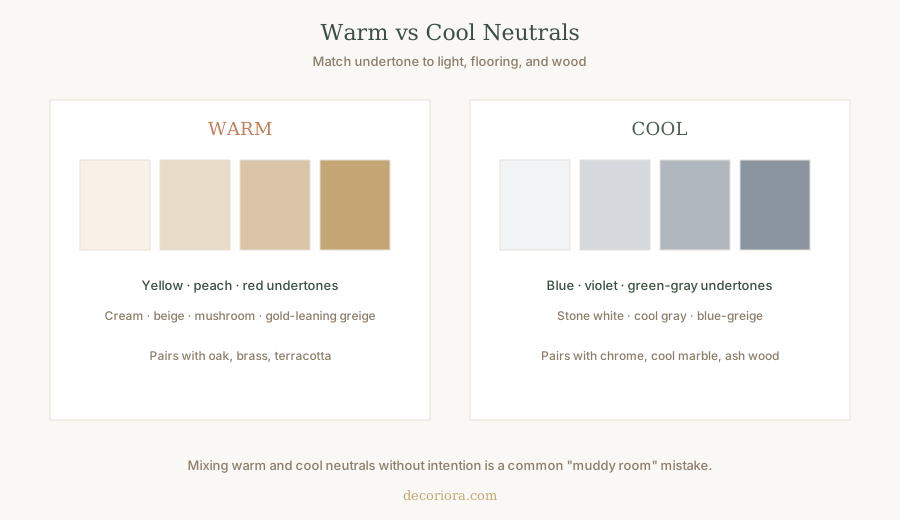
| Family | Undertone feel | Often pairs with |
|---|---|---|
| Warm | Cream, peach, gold, soft red | Oak, brass, terracotta, linen |
| Cool | Blue, violet, cool green-gray | Chrome, cool stone, ash woods |
Warm neutrals usually feel more welcoming in American homes with wood floors and warm bulbs (2700K to 3000K). Cool neutrals can look crisp in bright modern spaces, but they often feel chilly in north light.
White vs off-white
True bright white can look gallery-clean or harsh and clinical. Many designers prefer off-white or warm white for homes because it softens shadows and flatters skin and wood.
Use brighter white when:
- You want maximum bounce in a dark hall (still sample carefully)
- Trim needs a crisp contrast against deeper walls
Use soft warm white when:
- You want rooms to feel larger without sterility
- Floors are warm oak or honey tones
Cream tones
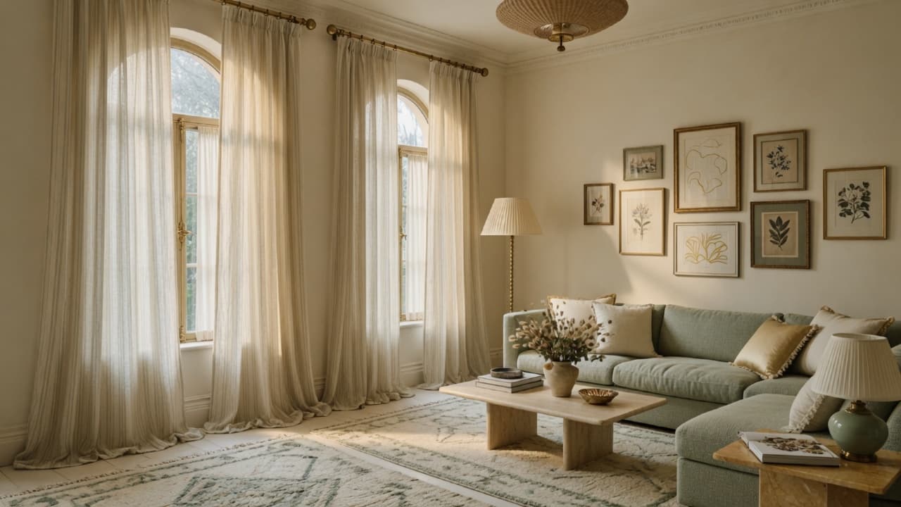
Cream sits between white and beige. It adds warmth without heavy color. Cream walls love natural textures, high curtains, and layered rugs. In small apartments, cream can expand a room more gently than stark white. See also small apartment decorating ideas for scale and light strategies that pair with pale walls.
Beige
Beige is classic when the undertone is soft, not orange or dusty pink. Modern beige leans closer to stone or oatmeal than 1990s yellow-beige.
Best for: living rooms, dining rooms, entries that need warmth.
Greige
Greige is gray + beige. Balanced greige is one of the most useful whole-home neutrals of the last decade because it bridges warm wood and modern furniture.
Watch for: blue-gray greiges that turn cold at night.
Taupe and mushroom
Taupe and mushroom sit deeper than beige. They add sophistication and hide slight wall imperfections better than pure white. They work beautifully in bedrooms, dining rooms, and powder rooms when you want intimacy.
Soft sage
Soft sage behaves like a quiet neutral when it is muted enough. It connects to plants, linen, and natural light without reading as a bold green. Excellent for bedrooms, baths, and offices that need calm focus.
Warm gray
Warm gray (stone, putty) avoids the blue cast of trendy cool grays. It is versatile with black accents, oak, and soft metallics.
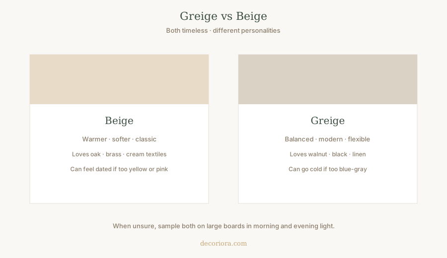
Greige vs beige
| Beige | Greige | |
|---|---|---|
| Feel | Warmer, softer, classic | More modern, flexible |
| Risk | Can yellow or pink | Can go cold/blue |
| Best with | Brass, oak, cream textiles | Walnut, linen, soft black |
| Choose when | Home already warm and cozy | You want bridge between warm and cool elements |
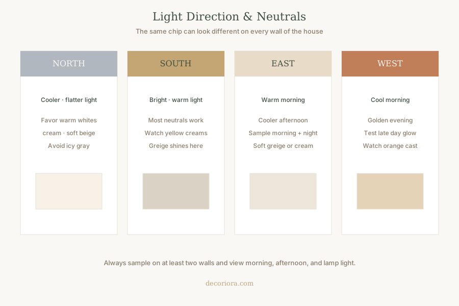
Choosing paint based on natural light
North-facing rooms
Light is cooler and flatter. Prefer warm whites, cream, soft beige, warm greige. Avoid icy grays that look dingy.
South-facing rooms
Light is bright and warm. Most neutrals work. Watch creams that go too yellow at noon. Greige and soft white often excel.
East-facing rooms
Warm in the morning, cooler later. Sample in both morning and evening. Soft greige or cream usually adapts well.
West-facing rooms
Cooler earlier, golden later. Test late-day light so walls do not turn peach or muddy. Balanced greige and warm gray are safe experiments.
Best neutral paint colors by room
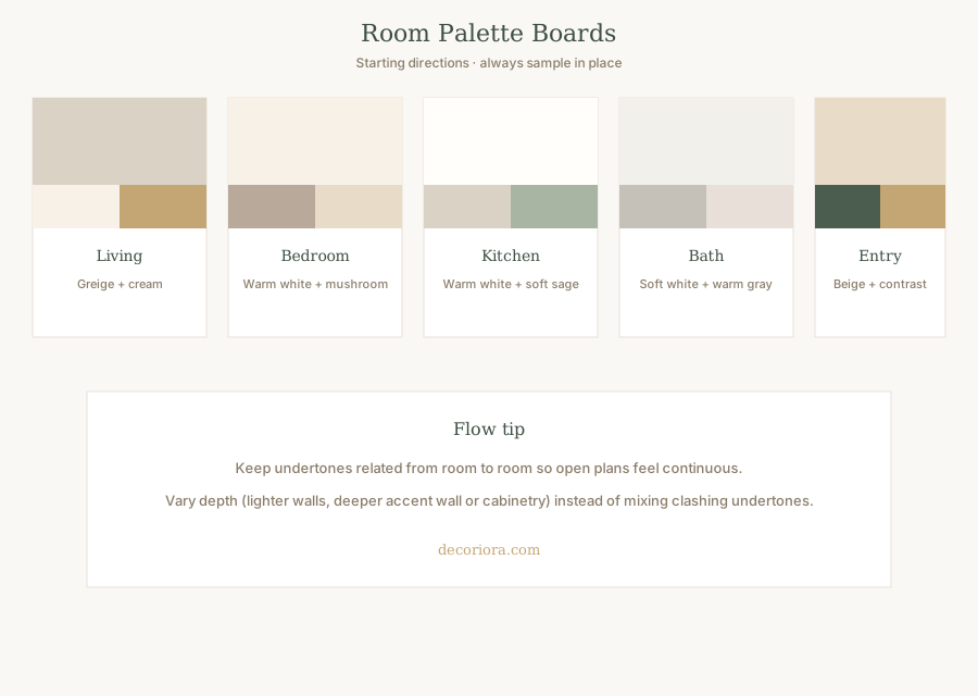
Living room
Goal: Flexible backdrop for art, sofas, and evening lamps.
Strong directions: balanced greige, soft warm white, light mushroom.
Keep walls quiet so rug scale and curtain height can do the expensive-looking work.
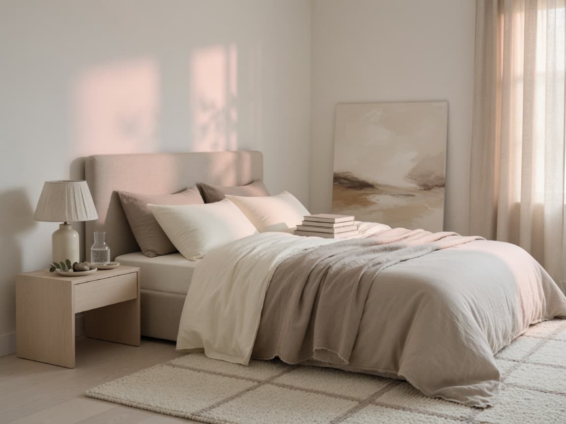
Bedroom
Goal: Rest and softness.
Strong directions: warm white, cream, mushroom, soft sage.
Deeper taupes create cocooning primary suites. Keep ceilings lighter for air.
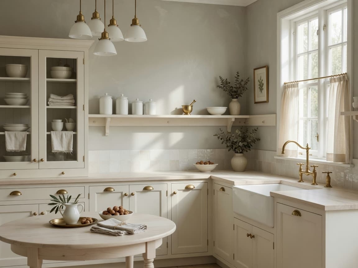
Kitchen
Goal: Clean, bright, durable.
Strong directions: warm white walls with soft greige or soft sage islands/cabinets if you paint them.
Sheen matters here (satin or durable eggshell). Pair with clear counters and good light.
Bathroom
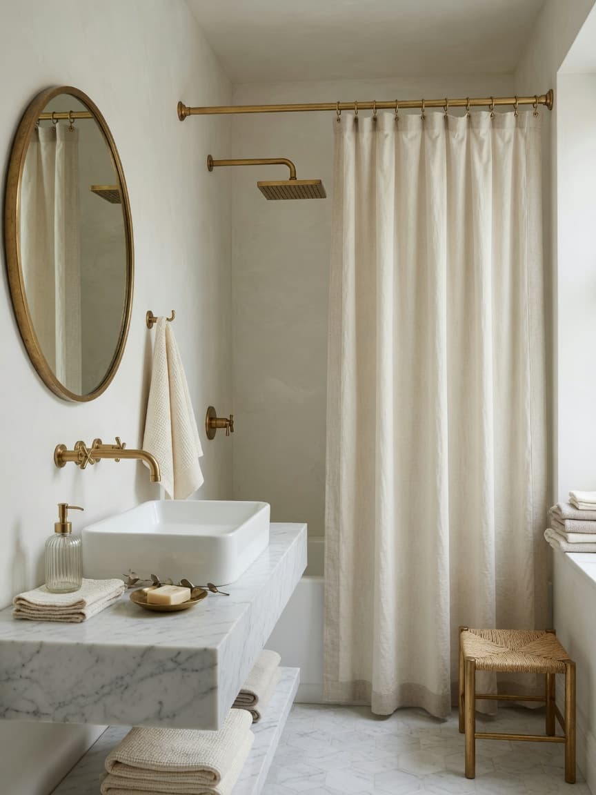
Goal: Fresh without cold hospital white.
Strong directions: soft white, warm gray, pale greige, muted sage.
Use moisture-appropriate paint and higher-scrub finishes where needed.
Dining room
Goal: Atmosphere for evening.
Strong directions: deeper greige, taupe, mushroom; or soft cream if you want airy entertaining.
Dining rooms tolerate slightly deeper neutrals because they are often used at night under lamps.
Entryway
Goal: Welcome and durability.
Strong directions: warm greige or soft beige that connects to main living spaces.
Entries take scuffs; eggshell or satin helps. A cohesive entry color sets the story for the home.
Home office
Goal: Focus without gloom.
Strong directions: soft sage, warm greige, light mushroom.
Avoid stark cool white that causes glare on screens. Add layered lamps.
Paint finish guide
| Finish | Look | Best uses |
|---|---|---|
| Matte / Flat | Soft, hides flaws | Ceilings, low-touch adult spaces |
| Eggshell | Soft low sheen | Most walls: living, bed, hall |
| Satin | Noticeable durability | Kitchens, kids rooms, busy halls |
| Semi-gloss | Reflective, scrubbable | Trim, doors, many cabinets |
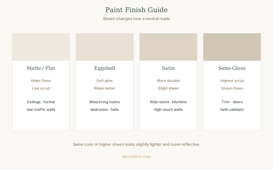
Same color in higher sheen reads slightly lighter. Always sample the sheen you will actually buy.
Designer color pairing ideas
Use the 60-30-10 idea from expensive-looking homes:
- 60% main wall neutral
- 30% secondary (sofa, rug, curtains, wood)
- 10% accent (pillows, art, metal, pottery)
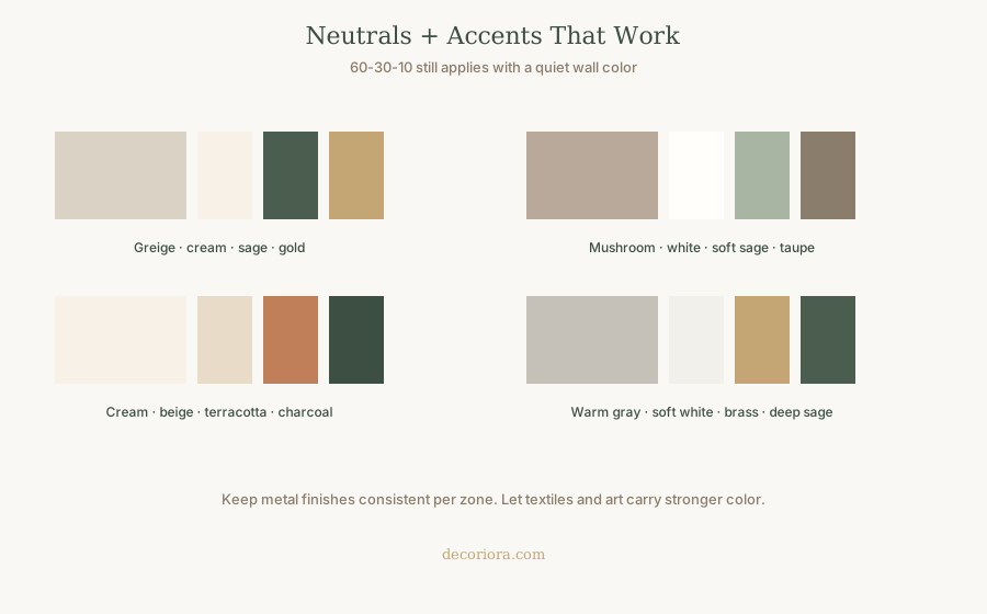
Timeless pairings:
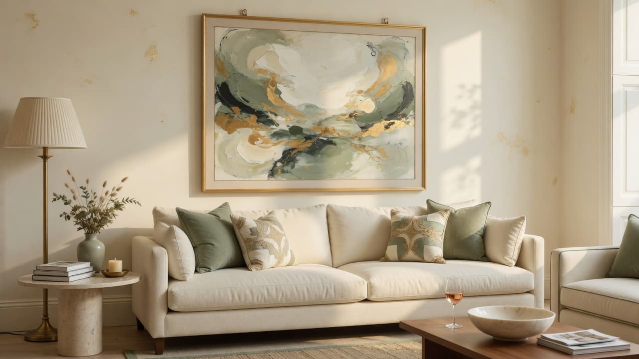
- Greige walls + cream trim + sage textiles + soft gold
- Cream walls + oak + terracotta accents + charcoal art frames
- Mushroom walls + white trim + linen + black hardware
- Warm gray walls + soft white + brass + deep green accents
A full warm, collected interior system is also the heart of Anthropologie Inspired Home Without Overspending: color and texture working together room by room.
Accent color combinations that stay elegant
| Wall neutral | Accent ideas that age well |
|---|---|
| Warm white / cream | Sage, terracotta, soft black, navy art |
| Greige | Olive, rust, charcoal, aged brass |
| Mushroom / taupe | Blush clay, forest, ivory, walnut |
| Soft sage | Cream, sand, chocolate, brass |
| Warm gray | Camel, black, dusty blue, oak |
Keep metals consistent within a zone. Let textiles carry trend color so walls stay timeless.
Common paint mistakes
| Mistake | Why it fails | Better approach |
|---|---|---|
| Choosing under store lights only | Wrong undertone at home | Large in-room samples |
| Mixing warm and cool neutrals randomly | Muddy, unsettled rooms | One undertone family per open plan |
| Too-cool gray with warm oak | Floors and walls fight | Warm greige or beige |
| Painting without testing night light | Shock at 8 p.m. | Check bulbs at 2700-3000K |
| All rooms different undertones | House feels chopped | Related neutrals, varied depth |
| Wrong sheen | Scrubs poorly or looks shiny | Eggshell walls, semi-gloss trim |
| Skipping primer when needed | Patchy color | Proper prep and primer |
Renters and temporary color strategies
If you cannot repaint, you can still use neutral strategy:
- Large art and textiles in a cohesive neutral family
- Curtains and rugs that correct cool builder white
- Warm bulbs to shift how white walls read
- Removable wallpaper only if your lease allows
More damage-free ideas: Renter-Friendly Home Decor Guide.
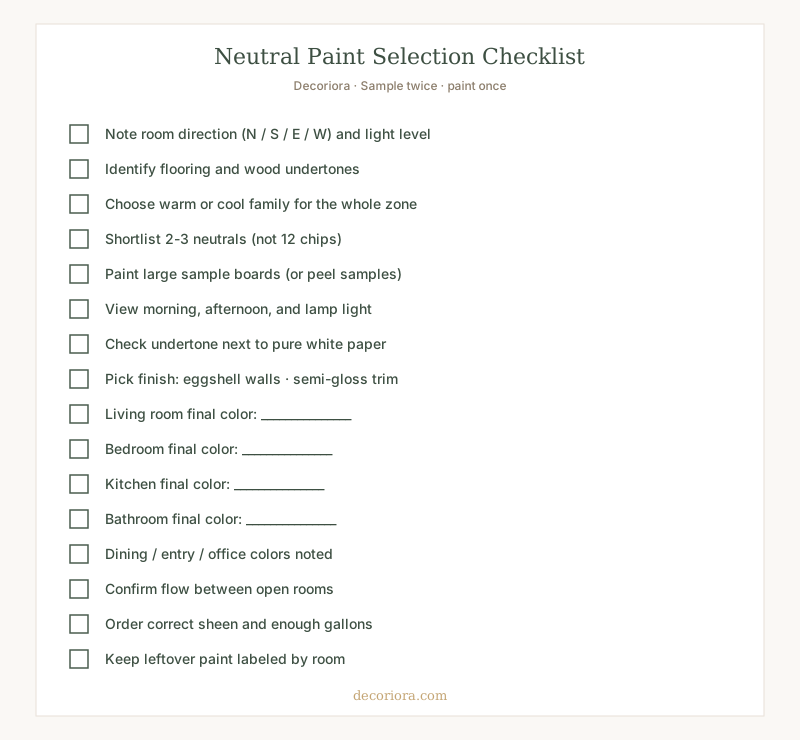
Printable paint selection checklist
Save or print this checklist before you buy gallons.
Putting it all together
To choose the best neutral paint colors for every room:
- Read the light (N/S/E/W)
- Match undertones to floors and wood
- Pick a warm or cool family for connected spaces
- Shortlist two or three chips, not twenty
- Sample large, at all times of day
- Choose sheen for lifestyle
- Keep whole-home flow, vary depth not undertone chaos
Timeless interiors start with the right colors as a quiet foundation. Furniture, curtains hung high, and correctly scaled rugs finish the story.
When you want a complete room-by-room path to a warm, collected home on a thoughtful budget, explore Anthropologie Inspired Home Without Overspending.
From Our Collection
Anthropologie Inspired Home Without Overspending
A room-by-room system for warm neutrals, layered textures, and timeless styling decisions that make a home feel collected without overspending.
Your walls do not need a trend name. They need a clear undertone, honest samples, and a finish you can live with for years.
Frequently asked questions
What are the best neutral paint colors that never go out of style?
Timeless neutrals include warm white, soft cream, balanced greige, true beige with a soft undertone, mushroom taupe, soft sage as a quiet neutral-green, and warm gray. The best choice depends on undertone and light more than the marketing name on the chip.
What paint color makes a room look bigger?
Light warm whites, soft creams, and pale greiges usually make rooms feel larger when they match the room's light. Continuous color on walls and trim can expand a space visually. Cool, dingy, or mismatched neutrals can make a room feel smaller even if the color is pale.
What neutral colors do interior designers recommend?
Designers typically recommend sampling warm whites and greiges first, matching undertones to flooring and wood, and keeping whole-home flow consistent. They prioritize large samples in real light over choosing from a tiny chip under store lighting.
Is greige better than beige?
Neither is universally better. Beige reads warmer and more classic; greige balances gray and beige for a more modern flexibility. Choose based on your wood tones, metal finishes, and whether your light runs cool or warm.
What paint finish should I use with neutral wall colors?
Eggshell is a strong default for most living areas and bedrooms. Use satin in higher-touch rooms, matte or flat on ceilings, and semi-gloss on trim and doors. Higher sheen makes the same neutral look slightly lighter and more reflective.